Hurricane Analysis


This map illustrates hurricanes located in the Atlantic Ocean in 2000. This map was created using Tracking Analyst in ArcMap.

Again, this map illustrates hurricanes located in the Atlantic Ocean in 2000. However, this time there is a line connecting the paths of the hurricanes. Here we can see that most hurricanes originate off the west coast of Africa and work their way west, then northeast where they dissipate. We can also see that other hurricanes originate in the Atlantic off the east coast of North and South America, and in the Gulf of Mexico. Again many of these work their way west and dissipate, while others move west, then northeast where they dissipate.

This is a data wizard clock created with the Tracking Analyst wizard. This data was compile using months of the year and hours of the day. Here we can see that hurricanes took place in the months of August, September, and October; with the most hurricanes taking place in September. This is reasonable because hurricane season is often regarded as spanning a these three months in late summer and early autumn.

This map was created using the Playback Manager tool in the Tracking Analyst toolbar. Here the hurricane path was symbolized by past time. Meaing as the color changes you are able to depict how long ago the hurricane was taking that specific path. The hurricanes are also labeled with their names. This is helpful when analyzing data because they are named in alphabetical order. Here we can see the hurricane Alberto is the oldest and longest hurricane in duration at this specific time.

This map is similar to the one above, however this map also illustrates wind speed over 75 mph. Here we can see that wind speed 75 mph and greated typically takes place in over large areas of water where little land is present. However, this isn't alway true as we can see where wind speeds are 75 mph or greater near Mexico.

This map is, again, similiar to the one above; however, this map intesects wind speed 75 mph or greater with land. This type of analysis is important in terms of mitigation strategies. This is because wind speeds this high or greater can be devastating the human populations.
Archived Climatic Data Analysis

This graph shows an overall trend of
increasing temperature from 1990 to now. We can also see that each year varies
in comparison to the next. One year might be very warm and the following year
might be very cold. A prime example of this would be to look at this year
compared to last year. Last year shows the average temperature for the month of
March being over 50F and this year’s temperature in March being around 41F.
This year also compares in that temperatures are below average compared to
average March temperatures.

This graph illustrates climate data
for Wisconsin for the month of March. Trends for March are similar to the
trends seen in the U.S. graph above in that overall we can see that temperature
is increasing. Again, we can see that temperature varies from year to year
varies from year to year with some years being warm with the following year
being cold, just like the above graph. This year’s temperature in March is much
colder than last years, and is below average.

This graph illustrates an overall
trend of non-changing precipitation conditions for the U.S. We can see that
precipitation varies from year to year. Some years receive a lot of precipitation
and the following year may receive a much smaller amount. This year compares to
last year in that we received a much smaller amount of precipitation in March
compared to last year. We also received less precipitation compared to average conditions.

This graph illustrates that
precipitation for Wisconsin in the month of March. Like the U.S. graph above we
can see that the overall precipitation trend is non-changing. Again, some years
receive a lot of precipitation while the following year may receive very little
precipitation. This year compares to last year in that we received almost the
same amount of precipitation. We can also see that we received above average precipitation.
This is the first above average analysis made for this year when comparing
temperature and precipitation for the U.S. and Wisconsin in March.


An overall trend of cooler temperatures in the winter months and warmer temperatures in the summer months can be identified for both cities. An overall trend of more precipitation, in the form of rain, in the winter months compared to the summer months can also be identified. With this, we can see that both cities received more rain in the warmer months of the year compared to the cooler months. Months containing the highest temperatures include July and months containing the lowest temperature include January for both cities. Months containing the highest amount of precipitation include September for Madison and April, July, and August for Milwaukee.


Information for Minneapolis, MN, Madison, WI, and Wausau, WI
could not be located by the website.
1) Why
is it useful to compare your data to more than one of these locations?
Because, as we can see the further away a city is from Eau
Claire the more of a variation there is in comparison. For example, La Crosse
is closer to Eau Claire compared to the other two locations and is the most
similar in both temperature and precipitation. Milwaukee on the other hand is
further away. When comparing to Eau Claire we can see that precipitation
differs greatly and temperature is similar, but not as similar as La Crosse.
Superior is also about the same distance away as Milwaukee, but in the opposite
direction. Superior in located in northern Wisconsin and Milwaukee is in
southern Wisconsin. Again, we can see that Superior’s temperature is similar to
Eau Claire, as well as the precipitation.
With this we can also go in to comparing Milwaukee and Superior to one
another because they’re both located near a large body of water. The difference
is that Milwaukee is located on the west side and Superior is located on the
east side of the body of water. This will play a major role in the amount of
precipitation both locations receive.
2) What
variables may influence differences between those locations and our location?
Variable that may have an influence on climate may include
latitude, terrain, altitude, or nearby bodies of water and their currents. In
our case the bodies of water are probably the most relevant.
3) How
might these data vary from your data regarding your data collection techniques?
We collected our data using a kestrel and a GPS unit. This
website collects it’s data from numerous public domain sources such as World
Weather Records, Climate Anomaly Monitoring Systems (CAMS), World Monthly
Surface Station Climatology, Global precipitation data set, P. Jones,
Temperature data base for the world, and S. Nicholson’s African precipitation
data base, etc. This could differ in that some techniques may be more accurate
than others. They may also span a larger area than just standing in one spot
which would create more of an overage for an area opposed to a very local
recording. The data also dates back over a 30 year period and our data only
dates to one day at one time.
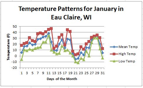


Overall, we can see that temperatures were colder in January gradually, month by month, becoming warmer by April. January and February both had temperatures below 0F, with March and April having no temperatures below 0F. We can also see that temperature varies in this same pattern. There is much more variation in January and gradually, month by month, becoming less in variation by April.


Overall, I don’t see much of a pattern in regards to temperature and rainfall. The only argument we might be able to make would be that days that receive rain tend to be warm. However, there are plenty of days that are warm that didn’t receive any rain at all.

January’s dominant wind direction was WNW, with W
coming in very close behind. This makes sense in relation to temperature and
precipitation both because winds coming from the WNW are going to bring cold polar
air temperatures with them, and cold air masses don’t carry a lot of moisture
with them.

February’s dominant wind direction was WNW, with WSW
and ESE coming in very close behind. This makes sense in comparison to both
temperature and precipitation. This is because winds coming from the WNW are
going to bring cold polar air temperatures with them, and cold air masses don’t
carry a lot of moisture with them. Winds coming from the WSW also won’t have a
lot of moisture associated with them. Winds coming from the ESE, on the other
hand, will be warm due to the air being brought in being warm from the south.
Warm air carries more moisture in it than cold air, and is being fed the
moisture from the ocean. This may be the reason for the large amount of
rainfall received around the 10th and 11th days of the
month.

March’s dominant wind direction was W. Again, this
makes in relation to temperature and precipitation both because winds coming
from the W are going to bring cold polar air temperatures with them, but not as
much cold air as winds coming from the N. This makes sense since it starts to
warm up more compared to January and February. The air coming from the W is
still going to be colder than air coming from the south. With that, cold air
masses don’t carry a lot of moisture with them. March also experience several
days with winds coming from the ESE. These winds could also be responsible for warming
temperatures and the rainfall that occurred towards the end of the month.

Again, April’s dominant wind direction was W, with
WNW and ESE coming in close behind. This one is a little bit trickier than the
previous 3 months as I would not expect that much rainfall with dominant winds
coming from the W. I realize there is still a lot of wind coming from the ESE,
but I would expect this to be the dominant wind direction in relation to
warming temperatures and the large amount of rainfall received.
Overall, trends we can see taking
place in Eau Claire, WI include warming temperatures from January to April. We
can also see that the amount of precipitation increases as temperatures become
warmer. We can also see a trend in wind direction. All dominant wind directions
include W winds, whether that is NWN or just W. We can also see a trend of a
shift in wind direction to the S in March and April, compared to January and
February. Although they are not the dominant wind patterns there are still
plenty of days in the months where some sort of direction is coming from the S,
whether that be WSW or ESE. These winds will bring warmer air with them in
relation to cold wind from the N and W. With that, we can see the increase in
air temperature and rainfall. The only anomaly that stuck out to me was the
increase in precipitation in April with some sort of S or E wind not being dominant.
However, this isn’t a drastic anomaly since the temperatures are warmer in
April compared to the other months, and warm air can carry more moisture in it.
When comparing these graphs to the
climograph of Eau Claire and La Crosse, WI we can see similar trends in both
temperature and precipitation. Temperature and precipitation both increased
from January to April. However, when comparing this to the climographs of Milwaukee
and Superior we can see a small difference. Temperature increases from January
to April, but precipitation is higher in January for both cities. This could be
due to both of them being located near a large body of water. This would influence
the both the temperature and the amount of water vapor in the air.
Microclimate Analysis

This map depicts microclimate for the UWEC campus. This map was created by 6 different groups of students collecting temperature (F) data with GPS units. The data was geoprocessed with all the groups data together using the Kriging interpolation method. However, the information being conveyed on this map is inaccurate. This is because the data used was collect on different days and at different times during the day. In order to depict microclimate accurately all data needs to be collected on the same day at the same time during the day.


Surface Maps Created from Wind Data


There are several steps involved in the production of a map. Here key steps involved examining the projections of our data, clipping our data, and turning our weather station dots in symbols that reflect wind speed and direction.
For the first map we produced the professor provided us with the United States and weather station data. For this map all we had to do was clip our weather stations to the United States outline, and change our weather stations into symbols that reflected wind speed and direction.
The second map was a little bit more tricky. Here we had to go the National Oceanic and Atmospheric Administration (NOAA) website and download our own weather station data. Once this was done we need to define the projection of our data. We defined it as WGS 1984. Once that was done a feature in Arc Map, known as project on the fly, projected the data to that of the data frames layer. This resulted in everything lining up properly. Next, we clipped our data to the outline of the United States. Finally, we were able to change our weather station dots into symbols that reflected wind speed and direction.
Illustration depicting Weather Patterns Based on the Surface of the area Enclosed in Yellow


Characteristics of Air Pressure Masses at the Earth's Surface
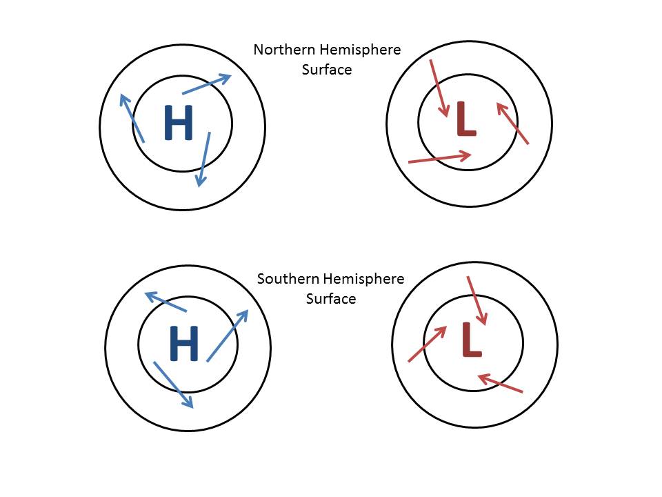
These images illustrate the direction of motion of different air masses in different hemispheres due to the coriolis effect.
Characteristics of Air Pressure Masses Movement Vertically

These images illustate the movement of different air masses in a vertical motion looking from the side. We can see that high air pressure sinks and low air pressure rises.
High and Low Pressure Air Masses, Different Types of Fronts, and Wind Speed

This surface map illustrates where high and low air masses are located and fronts that are associated with them. It also describes where the warm and cold air will be in relation to the front. Finally, small black arrows depict where highest wind speeds will be located in relation to isobars.
Air Masses

One of the oldest and simplest is the likelihood table. This is done by estimating a set of probability values for each quantitative variable. Then the results are plotted on a graph, with the y-axis representing the time trend and the x-axis representing the mean. For more ideal details about data analysis, head over to the website.
ReplyDelete